541-327-5045
541-327-5045
Salem, OR
Custom Website Design for Financial Planning Services in Salem, Oregon
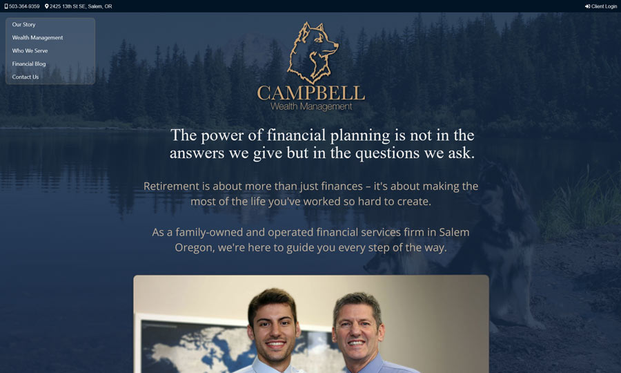
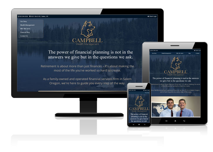
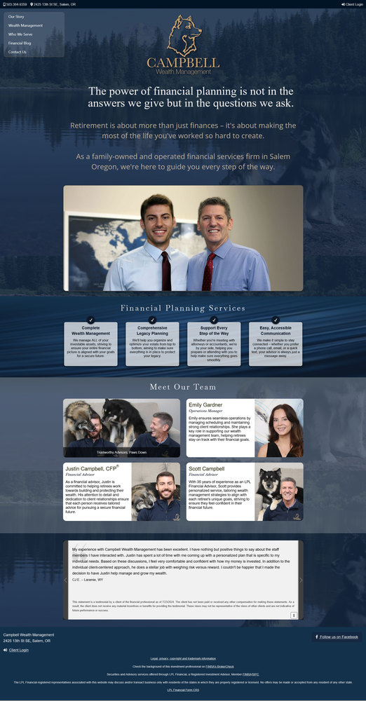
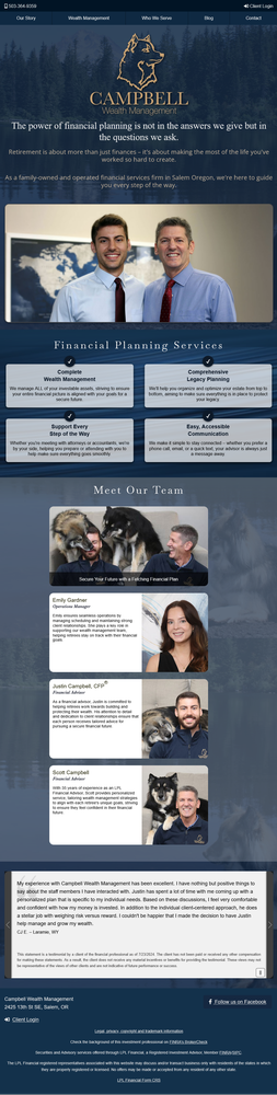
This project was designed for a client targeting wealthy retirees, with an emphasis on an elegant, desktop-first experience while maintaining full responsiveness for all screen sizes. The design features a semi-transparent floating menu, a large centered logo, and bold introductory text to create a strong first impression. A dark-themed color palette ensures a comfortable, easy-on-the-eyes browsing experience.
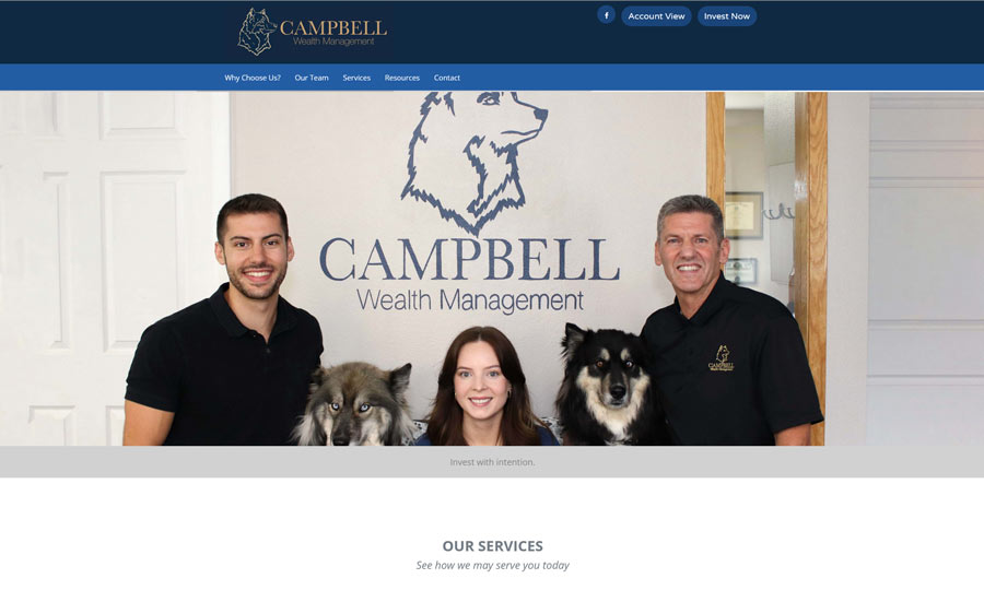
A key part of their brand identity is their dogs, which play a prominent role throughout the site, including a standout homepage presence.
Our Story Page: Each team member’s bio opens in a modal window, providing an immersive user experience. To boost SEO, we implemented unique URLs, titles, and metadata for each bio, ensuring Google indexes them as four separate pages rather than one.
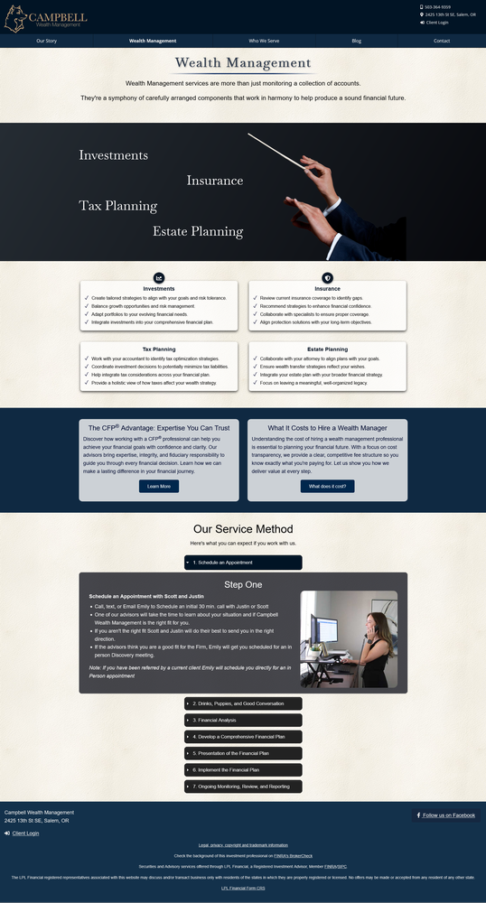
Wealth Management Page: This section features a bold, interactive "conductor" graphic that visually organizes and manages different financial planning categories.
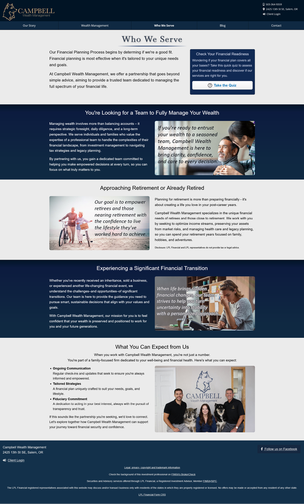
Who We Serve Page: Designed to attract their ideal client, this page includes an interactive quiz that helps users determine if the firm is the right fit for them.
Blog Integration: A WordPress blog was seamlessly incorporated using a custom child theme, ensuring the header and footer match the rest of the website for a consistent user experience.
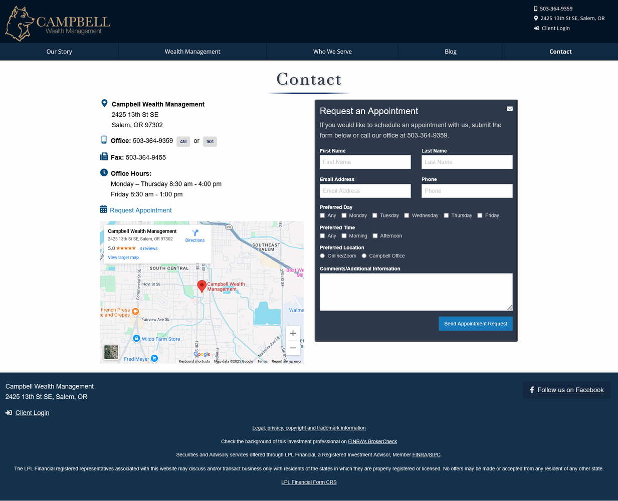
Flexible Contact Page: The contact form can easily be switched to an appointment form, offering flexibility for user engagement.
Visit Campbell Wealth Management
Build Year: 2025
Project Details: